Boxplots
I took a statistics course last fall, and there is a lot of code involved for the whole calculation of different parameters.
"Unfortunately" all of this is in R - which is undisputedly one of the best tools for statistics in general - but I don't know it well enough for some good results in a few minutes. So I started using Python with matplotlib.
One example are Boxplots, great for an overview of 5 important parameters: the median, the min and max (if in range), and the 50%-box (IQR).
Data
The data is from our professor, he provided weight and height of students from some years ago, 250 students in total.
After calculating the BMI entering the data, a first boxplot which can be automatically generated with boxplot(data) looks as follows:
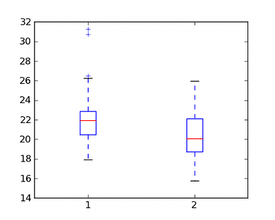
So, next up is some fine-tuning to make it look better.
Axes
At first, I wanted to take out some black lines from the axes, to make it more focussed on the boxplots themselves. I took some good propositions from here.
At first I removed these unnecessary "spines":
ax.spines['top'].set_visible(False)
ax.spines['right'].set_visible(False)
ax.spines['bottom'].set_visible(False)
Then the ticks:
ax.xaxis.set_ticks_position('none')
ax.yaxis.set_ticks_position('none')
Then, for better reading, I added some horizintal lines, part of the background grid:
ax.yaxis.grid(True, linestyle='-', which='major', color='lightgrey', alpha=0.5)Text
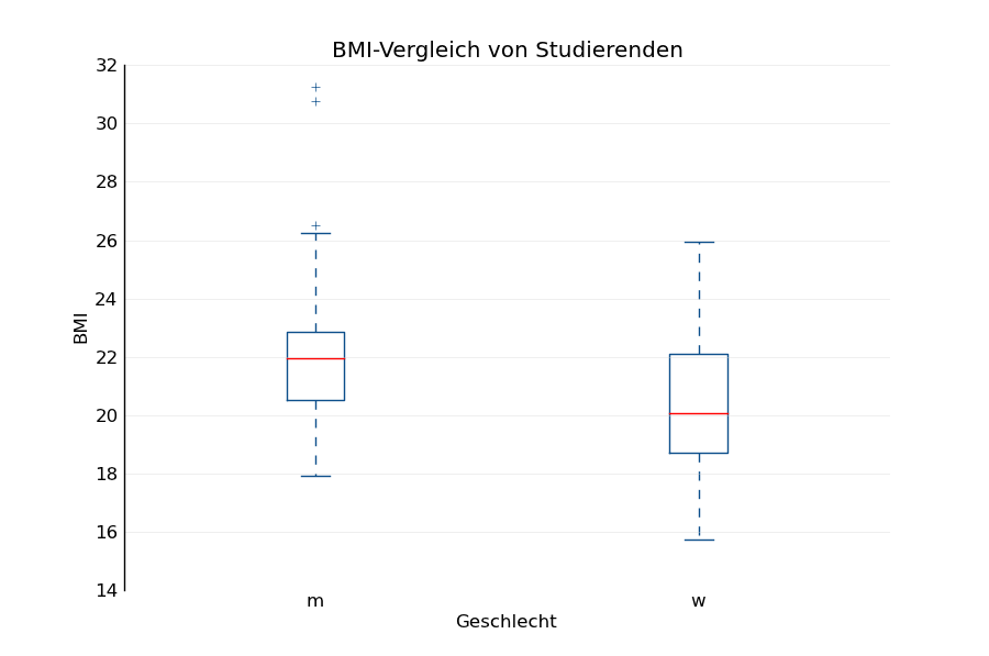
For better readability at first sight, some more explanation in the title and on the axes:
ax.set_title('BMI-Vergleich von Studierenden')
ax.set_xlabel('Geschlecht')
ax.set_ylabel('BMI')
pylab.xticks([1, 2], ['m', 'w'])
Color
But also the color wasn't what I had on my mind, the blue is quite aggressive. So I added a inidgo tone to all the elements except for the median. This can be done with setting the parameters for each class separately:
blue = '#0D4F8B' #indigo
pylab.plt.setp(bp['boxes'], color=blue)
pylab.plt.setp(bp['medians'], color='red')
pylab.plt.setp(bp['whiskers'], color=blue)
pylab.plt.setp(bp['fliers'], color=blue)
pylab.plt.setp(bp['caps'], color=blue)
Also, so the picture which is shown (beside the one that is saved) isn't presented in some grey box, you can add facecolor="white" when initiating.
So here's the final Boxplot:
Python Code (Python 2.7, matplotlib required)
'''Plots some boxplots about student BMI data.'''
__author__ = 'Adrianus Kleemans'
__date__ = '09.12.2014'

import pylab

# BMI data StatWiSo2003 (m, f)
data = [[17.9163, ... ]]

# create a figure instance
fig = pylab.plt.figure(1, figsize=(9, 6), facecolor="white")
ax = fig.add_subplot(111)
bp = ax.boxplot(data)

# remove axes and ticks
ax.spines['top'].set_visible(False)
ax.spines['right'].set_visible(False)
ax.spines['bottom'].set_visible(False)
ax.xaxis.set_ticks_position('none')
ax.yaxis.set_ticks_position('none')

# some helping lines
ax.yaxis.grid(True, linestyle='-', which='major',
    color='lightgrey', alpha=0.5)

# Hide these grid behind plot objects
ax.set_title('BMI-Vergleich von Studierenden')
ax.set_xlabel('Geschlecht')
ax.set_ylabel('BMI')
pylab.xticks([1, 2], ['m', 'w'])

# color boxplots
blue = '#0D4F8B' #indigo
pylab.plt.setp(bp['boxes'], color=blue)
pylab.plt.setp(bp['medians'], color='red')
pylab.plt.setp(bp['whiskers'], color=blue)
pylab.plt.setp(bp['fliers'], color=blue)
pylab.plt.setp(bp['caps'], color=blue)

fig.savefig('boxplot.png', bbox_inches='tight')
pylab.show()
That's it!
